Design strategy and visual principles for the homeware range of Argos following acquisition by Sainsbury's. The identity balances pre-determined visual assets from Sainsbury's Home with new elements unique to the Argos Home Brand.

The Brief —
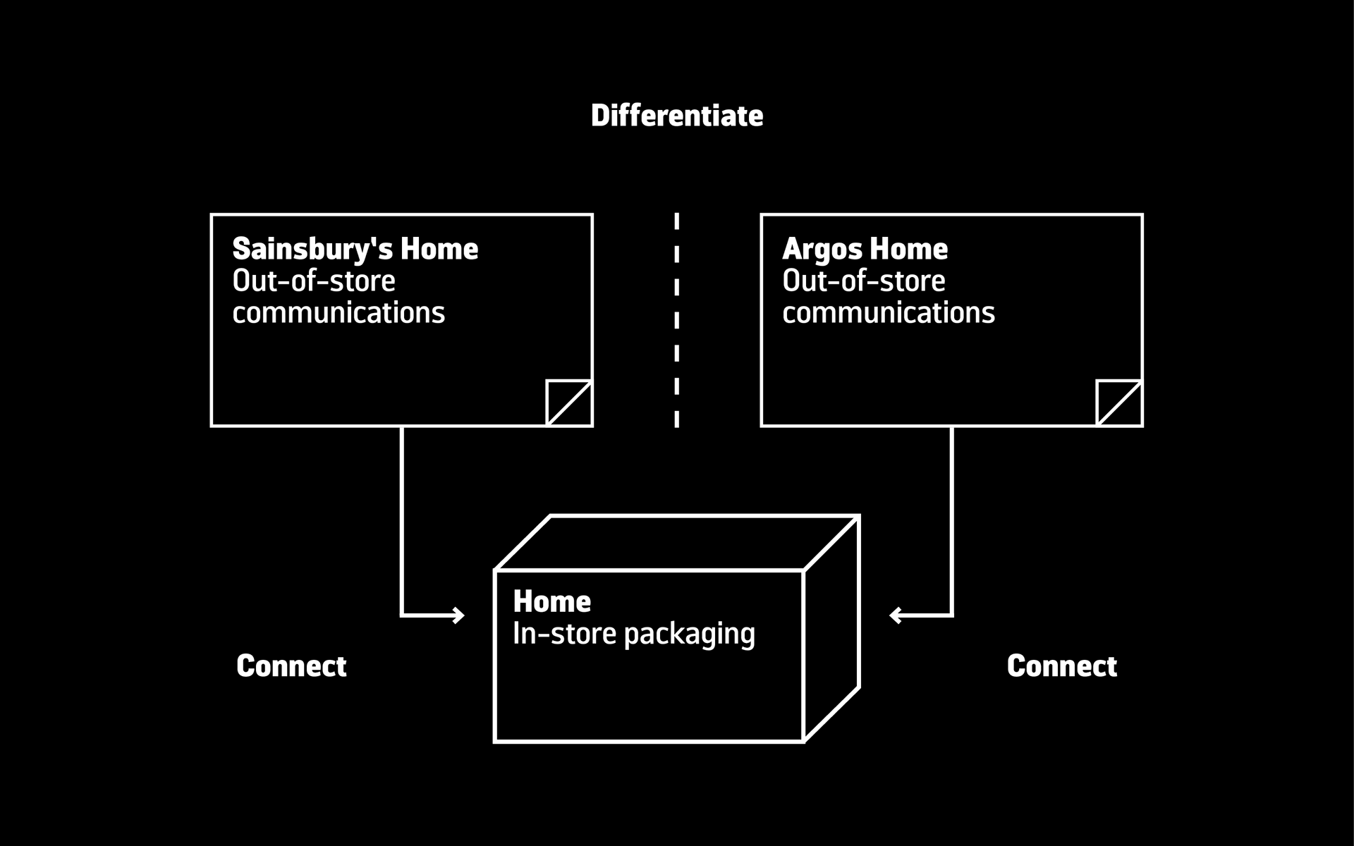
Create a brand identity to connect Argos Home out-of-store communications with the in-store Home packaging, at the same time differentiating from Sainsbury's Home out-of-store communications. An additional layer of complexity was the need to express tiering in order to help customers identify products based on price and quality.
System —
The toolkit balances pre-determined visual assets from Sainsbury's Home with elements unique to the Argos Home Brand.

How the system works —
1. Sainsbury’s Home and Argos Home are connected to the packaging by layout, imagery and by each owning a geometric pattern.
2. Sainsbury’s Home and Argos Home are distinguished from each other through variations of pattern, typeface and language.
3. Tiers are signposted by changing the tone and style of photography, and by style and/or scale of pattern.


Guidelines document.


Pattern construction. An adaptable and scalable asset that connects to Sainsbury's Home but gives Argos Home it's own visual language.


The result —
A balanced visual relationship, with Sainsbury's Home and Argos Home distinct from one another, but both still connected to the Home packaging.

My role
Design, development and production. Guidelines written and toolkit created.
Team
Creative direction – Mike Scott
Account management – Stephanie Down
Creative direction – Mike Scott
Account management – Stephanie Down
Designed at Siegel+Gale